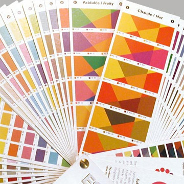
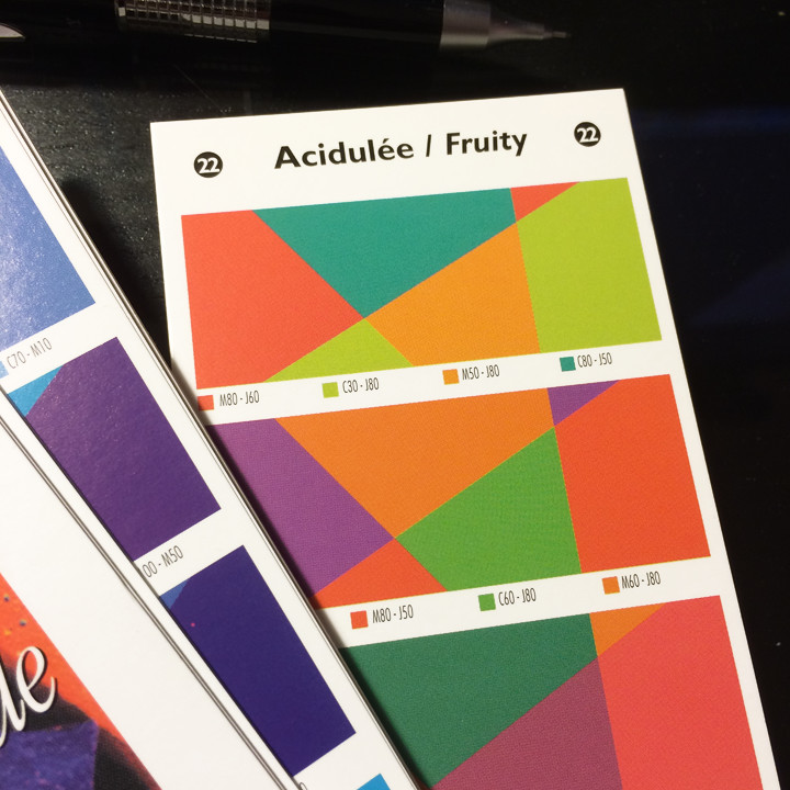
32 pages of color palettes and 8 pages of color families, in handy swatchbook form, categorized by the mood the author senses they evoke—cool, powerful, tropical, and so on. (I’m not big on color “moods” but I can appreciate the need to categorize.)
 Each includes the corresponding CMYK screen mix so you can choose the colors you like and accurately enter them, for online or print purposes, into your publishing, illustration, or photo editing program.
FROM CHUCK: Now that so much of what we produce is in color, finding combinations of colors that work well together has become more of a challenge than ever. I found this wonderful, intuitive, fan-deck tool by French designer Dominique Trapp a few years ago.
Color Harmony Guide, 32 pages
Thanks for your support. Have a question? Contact us here.


