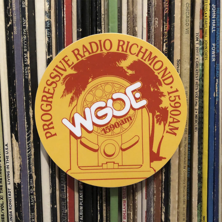
I’m not sure who nicknamed my WGOE logo the “WGOE Adhesion Circle” but after I designed it for WGOE’s general manager, Barry Coffman, in the mid 1970s, it quickly took on a life of its own—exactly what you hope for when you design a logo.
I don’t recall exactly why I chose the subject matter, but I do recall that visual elements such as palm trees, neon, flamingos, and art deco era objects (the radio) were, at the time (believe it or not), trendy (and tacky).
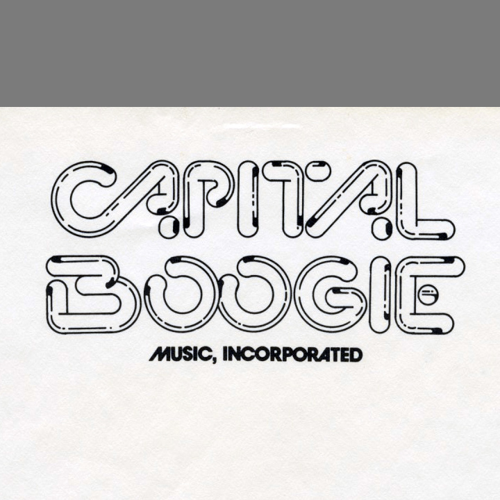
I do remember the origin of the typeface: When I was working as the designer of the Ten O’Clock News at WTTG-TV in Washington, D.C. in 1973, I designed a letterhead for a coworker’s music sideline (Larry Bryant’s Capitol Boogie) using a crude, neon-like typeface I designed for that purpose. I guess it stuck with me because it showed up a year or two later as the call letters “WGOE”.
Though the station is long gone, WGOE’s reputation as one of Richmond, Virginia’s first AOR stations (album-oriented rock), made it a symbol of that time and its young listeners. So recently, when I found the original negatives for the art in my files, I had some WGOE Adhesion Circles printed up. Now, when someone sees it on the the back window of my car and asks me about it, I can pull one from the glove compartment and hand it over, in every case, to a laugh and a smile.
Haha… so track me down around town, or, I offer them on EBay (see the link below).
Flashback to the WGOE Adhesion Circle Promo…
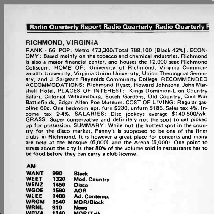
Here, from a 1976 radio publication, is a profile of Richmond in those days…
You can order a 1970s era WGOE Progressive Radio Richmond adhesion circle here…
You can order a T-shirt here…
WGOE Premium Circle-T, $24.99…
WGOE Long Sleeve Circle-T, $31.62…
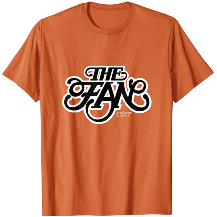
Here’s another logo from my attic…
The Fan District of Richmond, Virginia…
Posted in JUNE 2021 / Chuck Green is the principal of Logic Arts, a design and marketing firm, a contributor to numerous magazines and websites, and the author of books published by Random House, Peachpit Press, and Rockport Publishers. All rights reserved. Copyright 2007-2021 Chuck Green/Logic Arts Corporation. Contact.


Hello, Chuck.
When did you write this piece? I just found it. I never knew who designed the “adhesion circle.’ So it’s great to know now.
I was the guy who wrote, voiced and produced that radio promo, mixing in some other voices from our station. That was Barry, as the “arbiter of fine taste.”
I think Barry came up with the “adhesion circle” name as sort of a take-off on bumper stickers, and we ran with it.
I have seen the spot on YouTube before and so glad it’s still around.
When I was in Richmond, I lived closed to the Fan District on Grace Street.
Feel free to contact me if you wish. I live in the NYC area now.