

We’ve debated the ethics of the colorizing of black and white photographs recently—so I was interested when my friend Martin Bounds pointed to the fact that the New York Times chose to use a black and white photograph on its November 22nd cover commemorating the 50th anniversary of the Kennedy assassination.
Both color and black and white film was in wide use by November of 1963 (obviously) but very few newspapers had the presses for or inclination to print color. In fact, you might be surprised to recall that the New York Times didn’t print a color image on its frontpage until 1997.
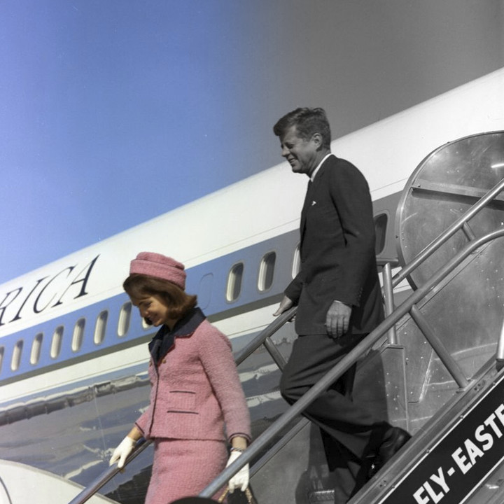
All this got me wondering how other newspapers handled their coverage of the anniversary and whether they chose to use color or black and white. Here’s a sampling and some further discussion. The photograph is credited to Cecil Stoughton,
Some reprinted their original front page (there were no full color newspapers in 1963)…
Some focus on black and white images…
The New York Times chose sepia tone…
Though, there were certainly many color versions of the same scene taken…
From 1993: Newspapers’ Adoption of Color Nearly Complete…
Other newspapers chose color images…
And this one used black and white to represent the past and color to represent the present…
Many of the newspaper cover pages for the anniversary are archived here by the Newseum…
And on a lighter note, John McWade alerted me to this other issue of colorization…
And horror of horrors: A color image by Walker Evans…
Originally posted in NOVEMBER of 2013 / Chuck Green is the principal of Logic Arts, a design and marketing firm, a contributor to numerous magazines and websites, and the author of books published by Random House, Peachpit Press, and Rockport Publishers. Contact.
Thoughts?