• Skip to primary navigation
  • Skip to main content
  • Skip to primary sidebar
  • Home
  • About
  • Store
  • Topics
    • All
    • Branding/Logos
    • Copywriting
    • Design Profession
    • Design Palettes
    • Ephemera
    • Technology
    • Illustration
    • Links
    • Marketing PR
    • Photography
    • Print Design
    • Typography
    • Web Design
  • Links
    • Illustration
    • Marketing & Public Relations
    • Photography
    • Print Design
    • Reference
    • Typography
    • Web Design
  • Subscribe
  • Contact
  • Search
monotype and nike

Typography

Monotype, the rebirth of Johnston, Transport of London, and a feat of design

by Chuck Green at ideabook.com

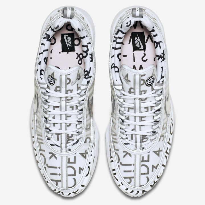
Tangled web huh? I’ve never been a huge athletic shoe design aficionado, but these type-centric shoes caught my eye in a recent post from the AIGA and I took a moment to track down the story. As it turns out, Monotype has given new life to the typeface Edward Johnston created for the London Transport 1916, some of the players had previous ties, and the Nike connection looked like a good fit.

Here’s a closeup of the design…

A post from It’s Nice That: Nike x Roundel: Fashion, apparel and Johnston 100 meet in new footwear collaboration…

About Monotype, Johnston100, and Transport for London…

So, assuming you’ve got to have them…

First saw the shoes in this post from the AIGA: How Monotype is Bursting the Design Bubble Around Typography, Starting With Its London Office

Subscribe to the Briefing

Next
Previous

Reader Interactions

Thoughts? Cancel reply

Your email address will not be published. Required fields are marked *

sidebar

Ideabook.com

  • Home
  • About
  • Store
  • Topics
  • Links
  • Subscribe
  • Contact
  • Search

Join Chuck Green and ideabook.com on
Facebook | Google+ | LinkedIn | Pinterest | Twitter