

If you want to experience how a truly great user interface can facilitate organizing, browsing, and reading articles, information, and illustrations, I point you to the Tablet Magazine website—I suggest, specifically, looking through it on a mobil device because that’s how I first experienced it and I think it reveals the best of what the designers and developers have accomplished.
Secondly, but no less important, consider how profoundly the style and function of this website transforms the magazine’s brand.
The site was designed by a team at Pentagram, led by Luke Hayman and Austin Maurer along with Laura McNeill, Shigeto Akiyama, Elyanna Blaser-Gould, and Ryan Smith. And it was developed by Sanctuary Computer.
A few of the things that caught my eye:
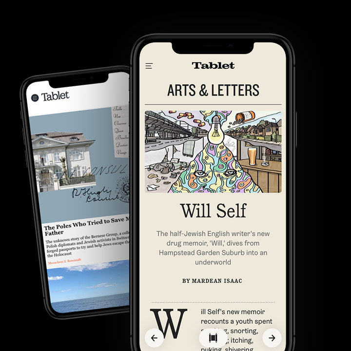
The simplicity and complexity of the typeface choices: Though the site uses just two typeface families, ITC Cushing and Graebenbach, the design, which is mostly type, achieves a particularly rich look and feel.
The restrained use of color: The illustrations first appear as black and white and morph into full color when you touch or roll over them. The bright white background is toned down with the use of a shade similar to newsprint. Watch how red boxes and text are used to classify certain types of information.
The deft positioning of elements on the page: The layout of type, separation devices, and imagery is precise but remains inviting. Though a publication like this contains an enormous number of stories and lots of information, it, to me, does not feel complicated or overwhelming.
The horizontal display technique: Something you don’t often see is horizontal navigation like this. The metaphor, of course, is a Torah Scroll (hence the Torah symbol and the left/right pointers. Nice idea that could rarely works well—in this case, it’s flawless.
How well the responsive versions meet the challenge: I am particularly impressed how well the site adapts to all three types of devices—mobile, tablet, and full display. Each does some clever things to maintain the unique UI and style.
Wow.
Here’s a broad overview of the site from Pentagram…
The Tablet Magazine site today…
The developer is Sanctuary Computer…
Posted in SEPTEMBER 2020 / Chuck Green is the principal of Logic Arts, a design and marketing firm, a contributor to numerous magazines and websites, and the author of books published by Random House, Peachpit Press, and Rockport Publishers. All rights reserved. Copyright 2007-2020 Chuck Green/Logic Arts Corporation. Contact.
Thoughts?