
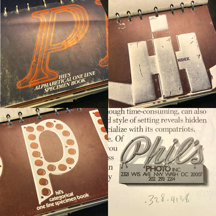
I’m waxing nostalgic today—about my favorite type specimen book from Phil’s Photo. On the East Coast at least, in the 1970s and 80s, Phil’s Photo in Washington, D.C., was one of THE places to order type. I used them all the time.
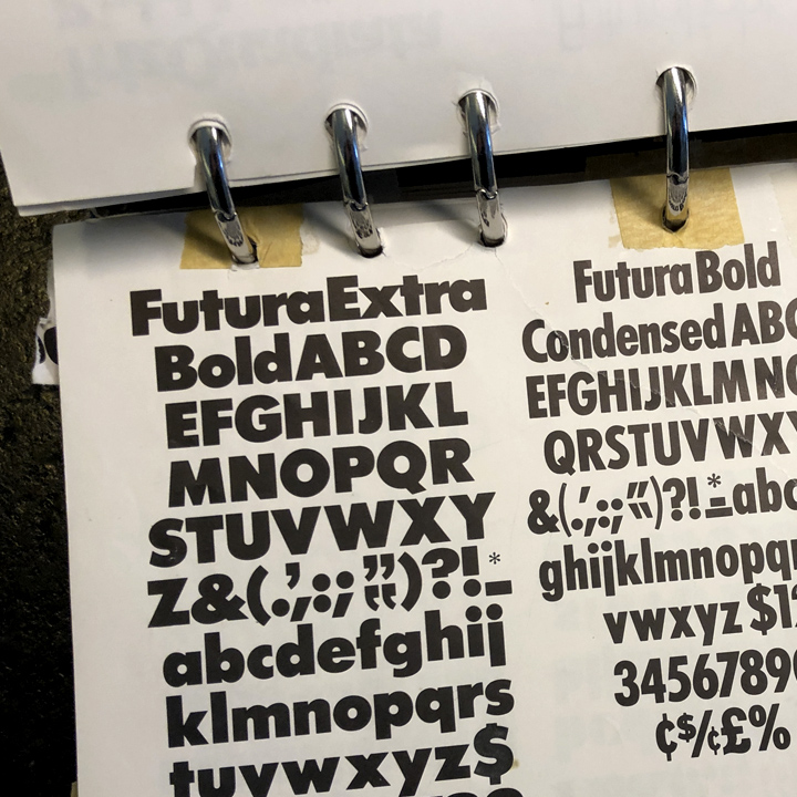
The process of laying out an ad or marketing piece back then went something like this: I’d pull a page from the specimen book, tape it to the deck of my electric-blue Goodkin Lucigraph, then trace individual characters on Bienfang Parchment Tracing Paper to produce headlines for the layout. On occasion, for a big presentation you’d have actual type set, but that was the exception, you’ve got to remember, at that time setting headlines on a Typositor cost as much as $4 per word.
Then you’d get out your pens and markers, rough in images and the logo, indicate lines of body text with squiggles or double lines, and spray mount the finished layout on a piece of Bainbridge Illustration Board—bingo, ready to present.
How did we get anything done?
When I posted a version of this elsewhere, someone quipped, “How did we get anything done?!”
Good question—with all the craft knowledge and expertise that was required to accomplish anything in the pre-1985 design world, it’s a wonder we got as much done as we did. In that pre-digital world, most of us did specific jobs:
Owner/Manager/Administrator
Art Director
Copywriter
Typesetter of Text
Typesetter of Headlines
Paste-up Artist
Illustrator
Photographer
Darkroom Operator
Photo Retoucher
Print Production Manager
and so on…
In the last 30+ years or more, I and many of my colleagues played many of those roles ourselves.
Good for you
My sense is, if you managed to make a living in our business in the last 30+, with the myriad of changes you had to navigate and adapt to, you deserve a pat on the back. We’ve gone from…
Film Photography to Digital Photography
Airbrush Retouching to Photoshop Retouching
Pasteup/Darkroom to Desktop Publishing
Metal Typography to Computer Typography
Conventional Media to Online media
Print Production to Web Development
and so on…
Much of the time we spent working with our hands, doing craft, has slowly been replace by typing and moving a cursor around a screen. Most of that change is good, some is not—just about everyone will agree, it’s been fascinating to be a part of the transformation.
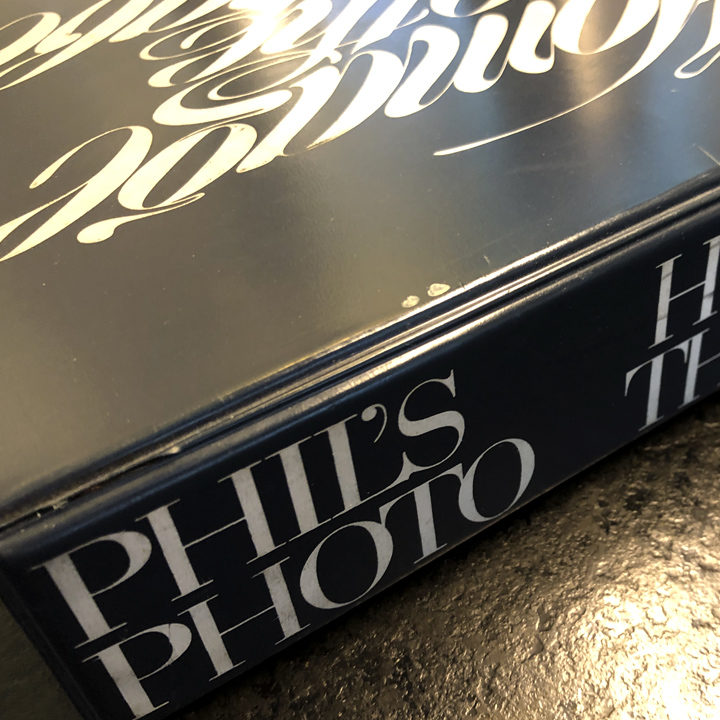
Homage to the Alphabet and Phil’s Photo
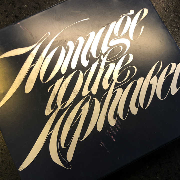
Years ago, Phil’s Photo became Phil’s Fonts. They even sell a typeface based on the binder design: Homage.
Phil’s Fonts and the Homage font…
Posted in NOVEMBER 2020 / Chuck Green is the principal of Logic Arts, a design and marketing firm, a contributor to numerous magazines and websites, and the author of books published by Random House, Peachpit Press, and Rockport Publishers. All rights reserved. Copyright 2007-2020 Chuck Green/Logic Arts Corporation. Contact.
Delighted to discover your website! Years ago, when waxers & xacto knives were essential tools, I owned the gorgeous book by “Phil’s Photo” that allowed me to order paper copies of alphabets and text to use for “paste up” on special projects for monied clients. The people who worked at “Phil’s” all had character, but I particularly remember one gent, very tall, quiet and a fine dry wit. In those days I would drive to “Phils” and I think they were out near Decatur Press…Have to admit that the fact that the 3 dimensional world seems to be disappearing, makes me sad. Pushing buttons is not nearly as satisfying as getting my “Rapidograph” pen unclogged. Thank you for this memory-stirring site.
Came across this today as I was reviewing my homage to the alphabet (deciding what to do with it as we are downsizing) and was delighted to read this post and your reply. Lanny was my professor at Penn State and we spent hours in the dark room and drafting tables. Happy memories and it sure has been a transformational journey. I was in the first graphic arts computer classes as Penn State and we used MAC SEs to create an animated video on floppy disks. This was totally radical – as I was simultaneously taking a comp programming course with punch cards. Such contrast. I do miss the craftsmanship and the satisfaction that comes from it.