• Skip to primary navigation
  • Skip to main content
  • Skip to primary sidebar
  • Home
  • About
  • Store
  • Topics
    • All
    • Branding/Logos
    • Copywriting
    • Design Profession
    • Design Palettes
    • Ephemera
    • Technology
    • Illustration
    • Links
    • Marketing PR
    • Photography
    • Print Design
    • Typography
    • Web Design
  • Links
    • Illustration
    • Marketing & Public Relations
    • Photography
    • Print Design
    • Reference
    • Typography
    • Web Design
  • Subscribe
  • Contact
  • Search

Typography

Typography that looks as if it was arranged by nature

by Chuck Green at ideabook.com

We talked a while back about Dick Sheaff’s wonderful collection of advertising ephemera from the last (roughly) 150 years. So when I stumbled upon Chad Michael, a designer who has amassed an impressive lineup of awards and mentions for his finely-tuned, beautifully-executed packages and labels over the last few years, I recognized, immediately, the bedrock on which it is built.

I just don’t get tired of seeing people who see composition through such sharp eyes and studied sensibilities. Some of his work looks as though it was arranged by nature.

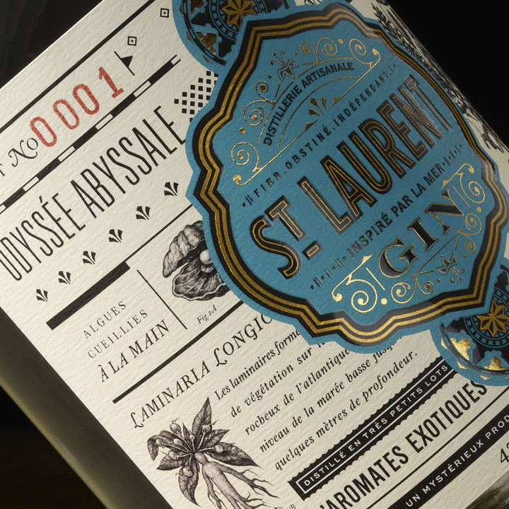
Design firm: Chad Michael Studio, Client: Distillerie du St. Laurent

Example 1…

Example 2…

Example 3…

Example 4…

The Chad Michael Studio website

Michael’s Instagram feed…

And his Dribbble feed…

Subscribe to the Briefing

Next
Previous

Reader Interactions

Thoughts? Cancel reply

Your email address will not be published. Required fields are marked *

sidebar

Ideabook.com

  • Home
  • About
  • Store
  • Topics
  • Links
  • Subscribe
  • Contact
  • Search

Join Chuck Green and ideabook.com on
Facebook | Google+ | LinkedIn | Pinterest | Twitter