

Handwriting translates life into words—at its best it seems to portray the writer’s state of mind, even their physical prowess. While one hand demonstrates a steely confidence another might reveal a state of abject perplexity. I’m not saying every hand tells an obvious story, I’m just saying handwriting fonts can be alive in ways conventional typefaces are not.
I’m am particularly attracted to antique handwriting—I think folks a century ago had more expressive handwriting because they used handwriting like we use keyboards—if you’re writing all the time, it’s easy and fluid. We type, they wrote. We read screens, they scratched ink into paper. Today, because we see handwriting less often than in years past, I think too, using it can be that much more impactful.
If you appreciate what I’m saying, I urge you to take a look at the handwriting typefaces Brian Willson has developed from handwritten examples he has studied. The length and breadth of his accomplishment is impressive—he has studied, selected, refined, and composed hundreds of individual characters and calculated the interplay of thousands of character combinations to produce typefaces so demanding they appear effortless.
A sampling of Willson’s typefaces from MyFonts.com:
An example of the samples from which he works:
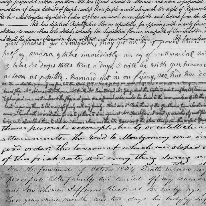
A letter from 1837, written by Emily Margaret Austin Perry…
And the result:
Try them out using the OldFonts.com Type Tester…
Willson is also the author of “The Antique Penman,” an occasional blog that offers a wide, interesting perspective on the subject of antique type and handwriting:
About OldFonts.com, Three Islands Press, and Brian Willson…
Posted in MARCH 2018 / Chuck Green is the principal of Logic Arts, a design and marketing firm, a contributor to numerous magazines and websites, and the author of books published by Random House, Peachpit Press, and Rockport Publishers. Contact.
Thoughts?