

As I heard it, Tom Shortlidge worked at Young & Rubicam in the late ’60s and moonlighted part-time at Crate & Barrel to make ends meet. The owner, Gordon Segal, asked him to take a look at some packaging designs he was considering. Mr. Shortlidge had a better idea.
Make no mistake about it, Crate & Barrel has a long track record of searching out, designing, and developing products people want—I do not presume to minimize how that has contributed to the brand’s longevity. But I doubt anyone would argue that Tom Shortlidge did not play a pivotal role as well. He established a design palette that made the product shot the center of interest—a palette so simple and insightful that it has survived, nearly intact, for over 50 years.
White space.
Classic typography.
Restraint.
Confidence.
The product is the hero. Not the headline. Not some gimmick. That decision—almost invisible in its humility—became the brand.
I’ve always been fascinated by the catalogue trade
I remember when the first Crate & Barrel catalogues hit our mailbox. They didn’t shout. They didn’t over-explain. They didn’t crowd the page with starbursts and dense copy blocks. They trusted the object. They trusted the customer’s eye.
And that trust felt modern.
It still does.
What You’re Looking At
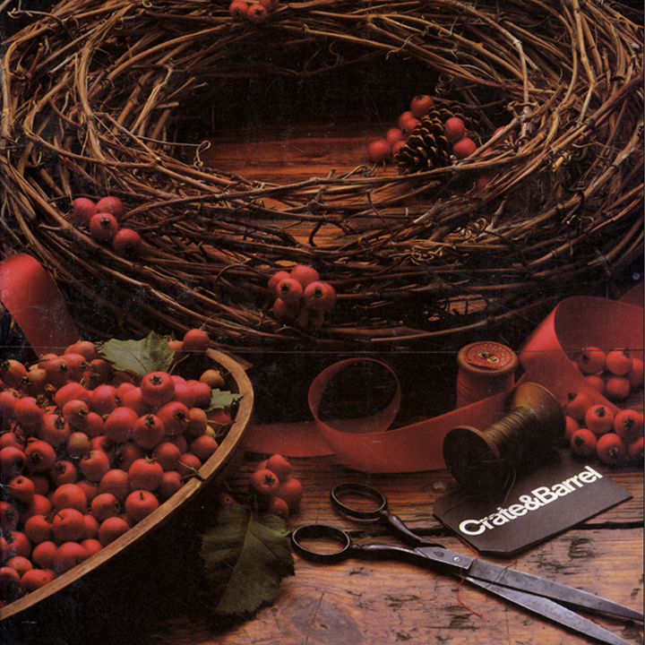
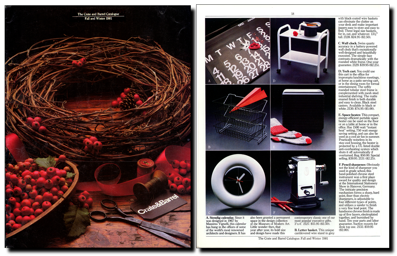
Left: The Crate & Barrel Catalogue cover from Fall and Winter 1981. Right: A product page from the same issue.
Notice what’s happening.
On the cover, it isn’t product screaming at you. It’s storytelling. A wreath. Red berries. Scissors. A spool of ribbon. A simple tag. The name sits quietly in the lower corner. No headline gymnastics. No promotional urgency. It is a still life—warm, tactile, confident—that brings you into a place you’d like to be.
On the inside page, the discipline tightens.
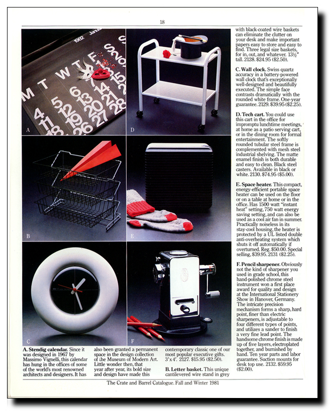
Six products.
Six thematic backgrounds.
Clear labeling.
Copy that builds on the story.
Each product stands apart, yet together they form a single story.
The process
If you have ever been on this type of shoot you recognize the deep colors, shadow shapes, and extreme sharpness of what was likely a 4 x 5 view camera (sheet film), lit with a large softbox, studio strobes, and reflectors.
In my mind I picture a team of creatives and assistants preparing for the next shot. Unpacking and assembling products, pairing them with carefully selected props. Composing images to fit within the confines of a carefully measured squares and rectangles.
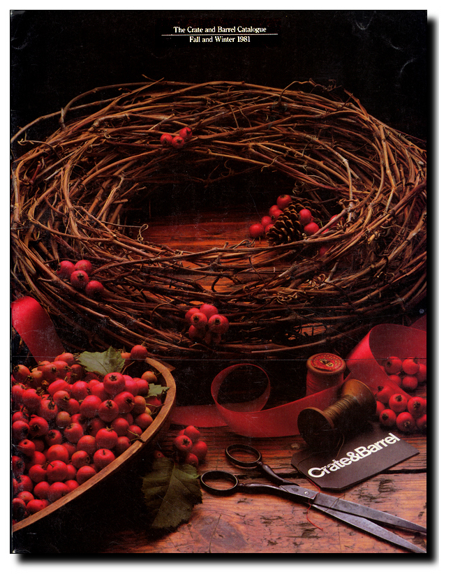
To create that cover, I imagine laying down the boards, filling the bowl with dried berries, perhaps hot gluing some in place to ensure they do not move, deciding whether there should be, for example, three or five cranberries at the top of the wreath. Finally, with everything in place, the photographer shoots a Polaroid to show the art director the lighting and cropping, ensuring there are no hotspots or reflections, and so on.
And when it’s done this well, the end results appear effortless.
Telling the story
The type—it looks like Century Old Style—is unobtrusive but key to establishing the style. Beyond necessary details and pricing, the copy tells us how each particular item fits the story. For example the calendar “has hung in the offices of some of the world’s most renowned architects and designers”. Or “This hand-polished chrome steel instrument won a first place award for quality and design at the International Stationery Show in Hanover, Germany”.
Look at the white clock.
Look at the wire basket.
Look at the pencil sharpener.
They are photographed almost like sculpture and described as objects of desire rather than mere practical acquisitions.
There is no decorative clutter. No competing visual noise. Just simple props, on this page, with simple red accents.
This is retail restraint.
And what strikes me most is that nothing about this feels dated. There’s no trendy typography. No period color palette. No ornamental excess. It could be reissued today with only minor tweaks.
That is not an accident. It is what happens when a brand decides that the product is the hero—and then refuses to abandon that conviction every time a new art director walks in the door.
A few companies have managed similar long-term discipline:
Apple Inc. — Product as hero. White space as authority. Packaging as ritual.
Braun under Dieter Rams — Reduction as principle.
IKEA — A constant Scandinavian design language
But even among these, longevity at this level—the disciplined, repeatable—is rare.
For a designer, this is more than nostalgia. It’s a reminder. If you build a system around clarity instead of fashion, you don’t have to redesign yourself every decade. You simply continue.
And that continuity becomes your identity.
What we are really looking at here is not a catalog design. It is a design system.
This year Crate & Barrel is celebrating its 60th anniversary…
A discussion of the fonts used…
The Chicago Design Archive’s tribute to Tom Shortlidge…
An in-depth interview with the founder of Crate & Barrel Gordon Segal…
Posted in FEBRUARY 2026 / Chuck Green is a contributor to numerous magazines and websites, and the author of books published by Random House, Peachpit Press, and Rockport Publishers. All rights reserved. Copyright 2007-2026 Chuck Green. Contact.
Yes, that is correct. I was a copywriter in Tom’s creative department when he was ECD. I can remember him working on Crate & Barrel layouts in his office–sometimes even after office hours! 🙂
Devon