• Skip to primary navigation
  • Skip to main content
  • Skip to primary sidebar
  • Home
  • About
  • Store
  • Topics
    • All
    • Branding/Logos
    • Copywriting
    • Design Profession
    • Design Palettes
    • Ephemera
    • Technology
    • Illustration
    • Links
    • Marketing PR
    • Photography
    • Print Design
    • Typography
    • Web Design
  • Links
    • Illustration
    • Marketing & Public Relations
    • Photography
    • Print Design
    • Reference
    • Typography
    • Web Design
  • Subscribe
  • Contact
  • Search
56 leonard

Design Profession

To me, this new skyscraper feels like graphic design

by Chuck Green at ideabook.com

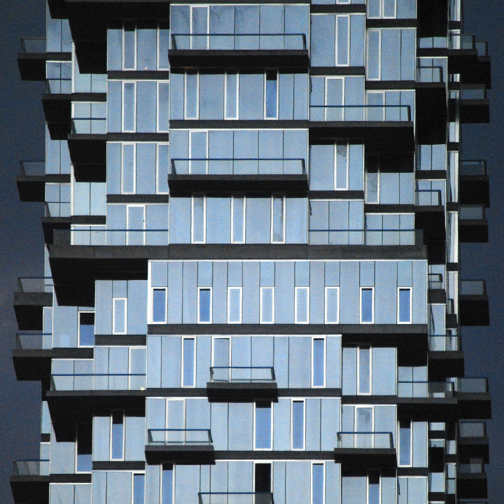
Does the new 56 Leonard tower in Tribeca feel like graphic design to you? I haven’t quite put my finger on it but there’s something about it that drew my eye to it the first time I saw it.

Maybe it’s the shapes that are slightly reminiscent of hot metal slugs. Or perhaps it’s just the cadence of evenly spaced windows on randomly stacked floors as if they are rows of type.

In any case, there’s something about it that whispers graphic design to me—and I love it.

The 56 Leonard website

As always, there’s lots of discussion and many interesting photographs about the building on SkyscraperCity.com…

The architect is Herzog & de Meuron…

Thanks to Carlos Restrepo for allowing me to use his handsome photograph (top).

Subscribe to the Briefing

Next
Previous

Reader Interactions

Comments

  1. Bogdan Iorga >

    February 13, 2017 at 7:21 am

    I read on their website that from the 145 apartments, only 5 of the are identical. That is pretty impressive. From the available renderings I think it will be a mixed building, residential and business.

    Reply

Thoughts? Cancel reply

Your email address will not be published. Required fields are marked *

sidebar

Ideabook.com

  • Home
  • About
  • Store
  • Topics
  • Links
  • Subscribe
  • Contact
  • Search

Join Chuck Green and ideabook.com on
Facebook | Google+ | LinkedIn | Pinterest | Twitter