


Chuck Green’s
Design Briefing Archive
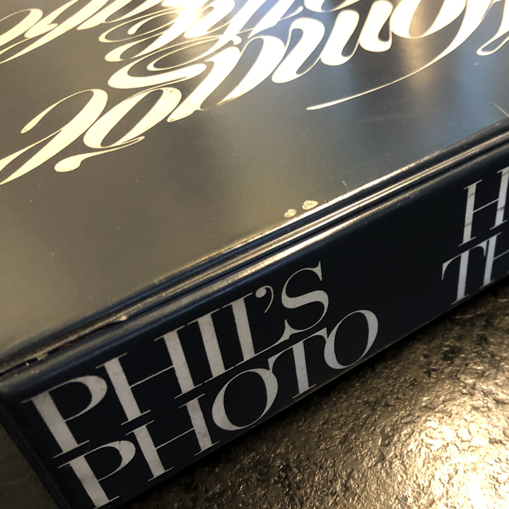
Homage to the Alphabet and Phil’s Photo
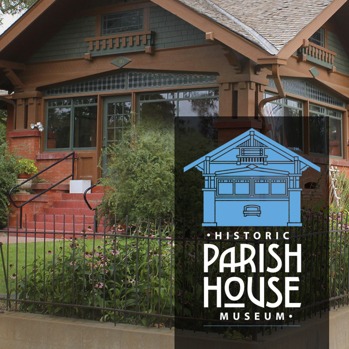
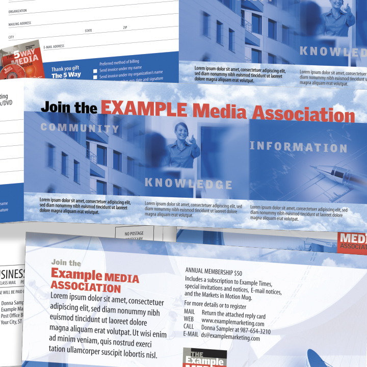
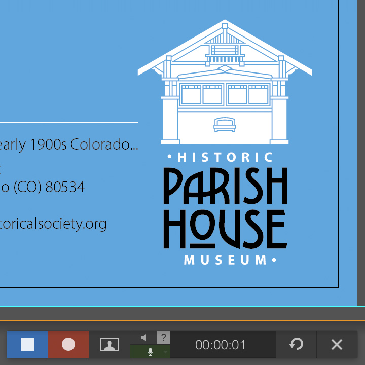
Non-profit branding: A small town historical society and museum…
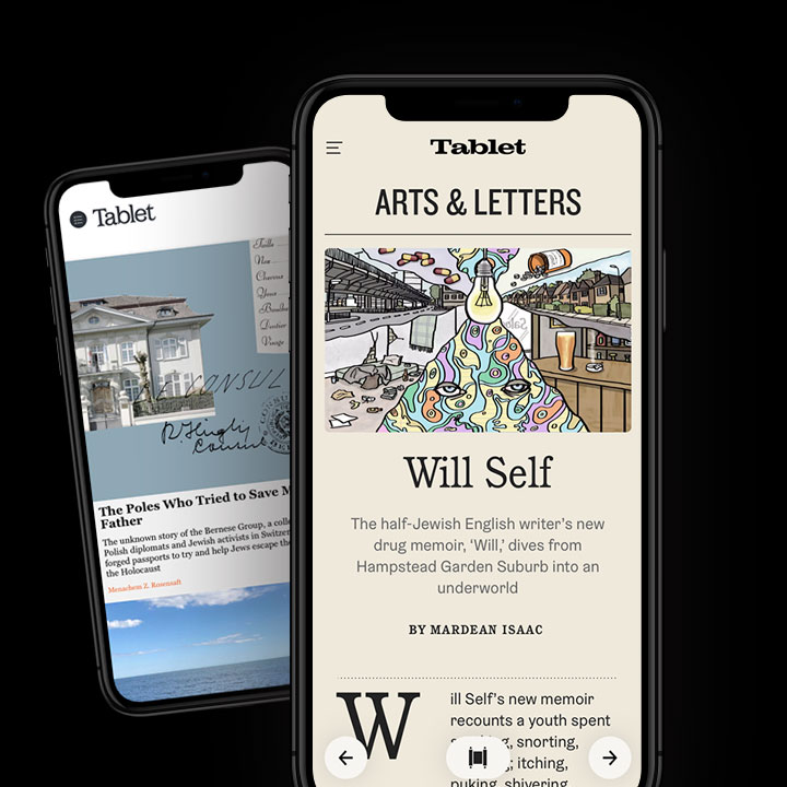
An example of brilliant user interface design—TabletMag.com…
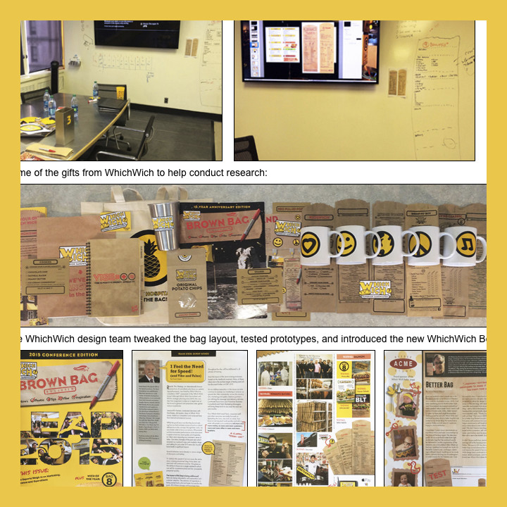
RSW: The quintessential “information architect”…
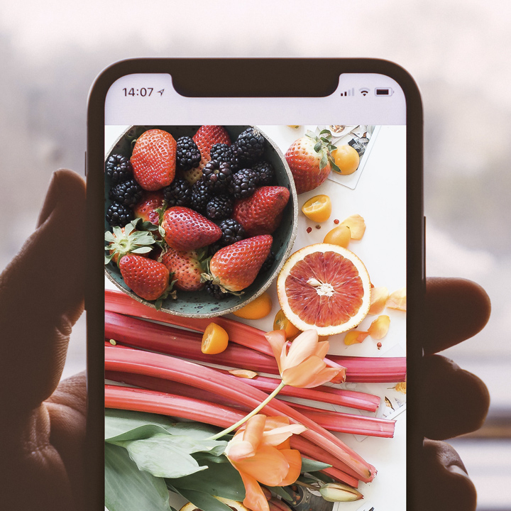
The art of food photography–with a smart phone camera

An introduction to the engraving print process
Thirty-plus years browsing online, this is still my favorite website…
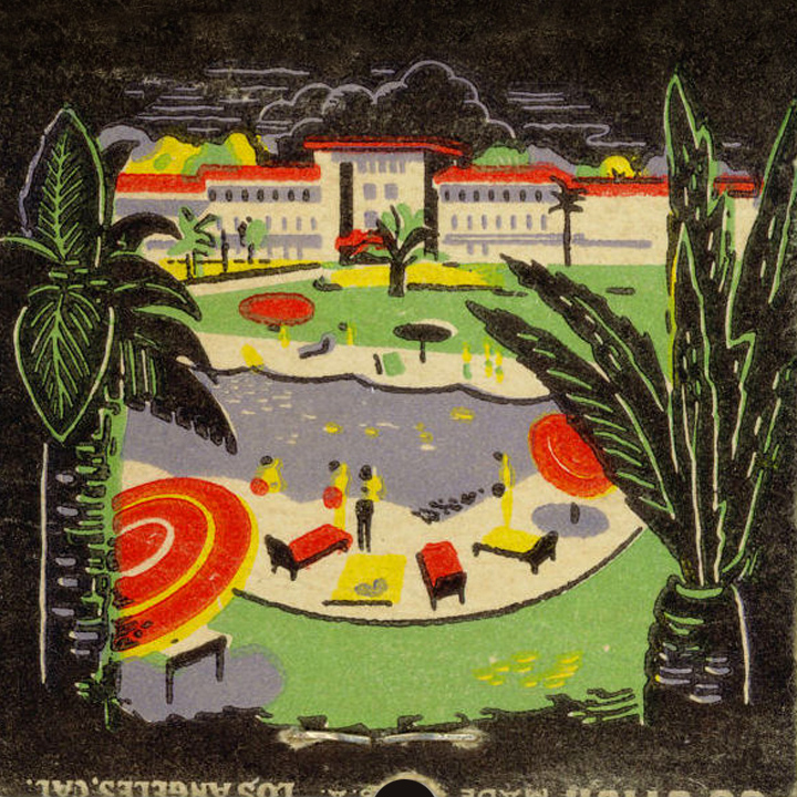
An unusual place to find logo inspiration…
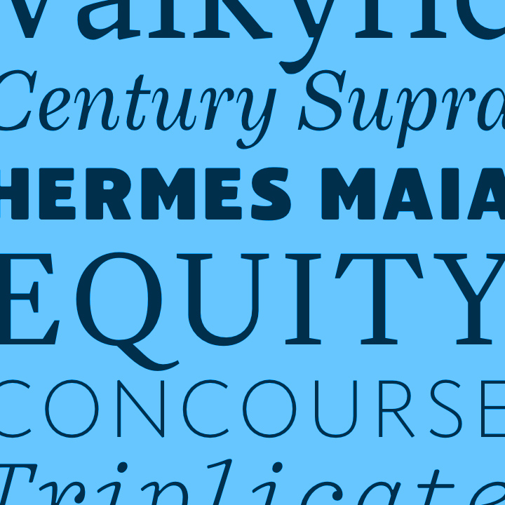
Established typography rules that only a fool would ignore…
Meet Eduardo Recife—artist, designer, typographer, illustrator, and photographer

5 principles of good graphic design
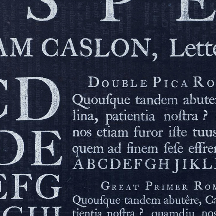
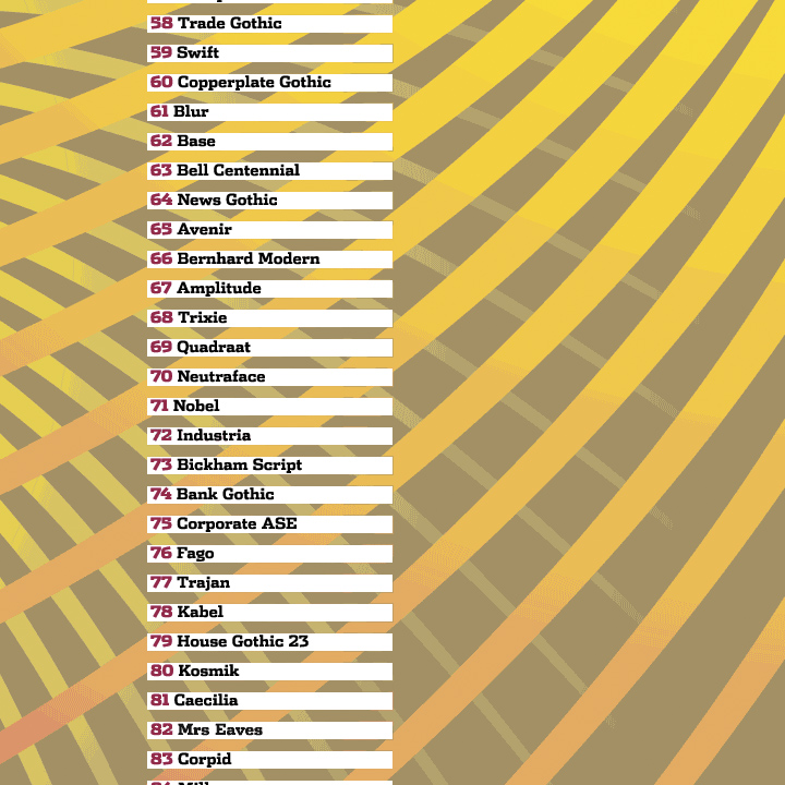
100+ books that celebrate fine typography…

How to print your graphic designs to fabric—and more…
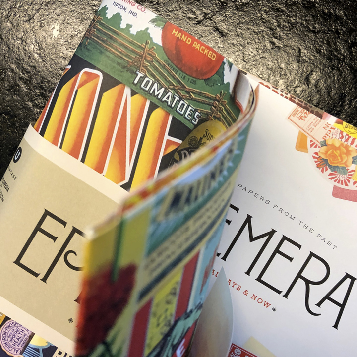
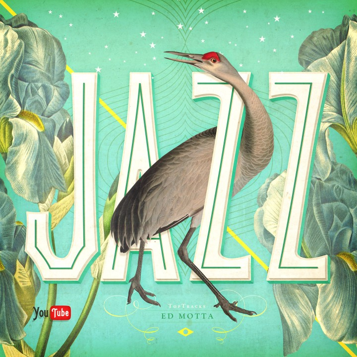
When graphic design is jazz: Ephemera, Forever, Always & Now
Snagit/ Screencast is an efficient, effective way to communicate with your clients…

The Southern Company’s logo is what branding is all about…
Can graphic design be learned?
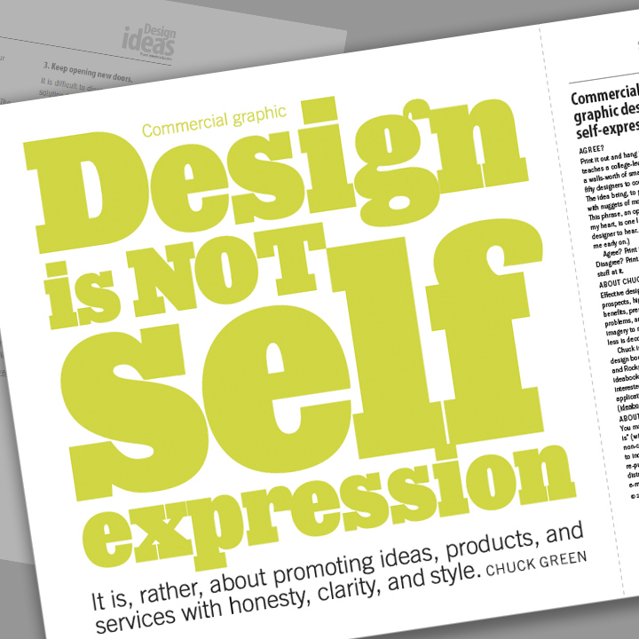
Commercial graphic design is not self-expression
Are you committed enough to design a logo?
Watch how BAFTA builds around a core image…